
Typography, taken apart
the messageA loupe and pliers for typography. Drop a font file and see what it actually says about itself — its anatomy, kerning, the designer provenance, the optical signatures. Then flip it forward: transform every glyph, or blend two outlines, and walk away with a real .otf.
heads up graf is an experimental research artifact, not production software. Use it for curiosity, teaching, and play — no promises about how it behaves, what it outputs, or whether that output breaks something downstream.
An intelligent viewer for looking at letterforms and the files that hold them. And a designtoy. Not really a font identifier. Not really a type-design tool. A prism you can use to mess with your fonts.
Built through Iterative LLM Co-Authorship — Phil Renato and Claude, trading drafts until the readings said what they meant. graf is a design thesis applied to itself: four wordmark faces at once. Each section cites the source it learned from, every derived font preserves every contributor’s credits in its own name table.
On the way in, graf parses the file through opentype.js and reads every table the designer actually shipped. The family, the foundry, the copyright, the license, every OpenType feature, every GPOS kerning pair, every variable-font axis. None of it is guessed — there’s no model in the loop here. The file is held in the browser’s memory and nowhere else.
On the way out, if you want one, graf drops a new font on you. Forge walks every glyph’s path commands, applying transforms. Mix interpolates outlines between two sources, or composes range-by-range across several. The output is a functional .otf — it installs in your operating system, sets type in Word, loads in Glyphs. Every source font’s copyright, license, designer, and foundry records travel verbatim in the output’s name table, plus a description line recording the transformation. Most licenses require that. Respecting the source is also just the posture.
graf also reads the license on the way in. A font that declares itself remixable gets forged and mixed. A font whose license forbids further modification, or forbids handing the modified file along, stays inspectable in Dig — but the write path is closed. A font graf writes is itself a remix, and the person who downloads it should be free to remix it in turn. If the source breaks that chain, graf declines to extend it.
Everything on screen is computed from the loaded file.
Nothing from nothing gets nothing.
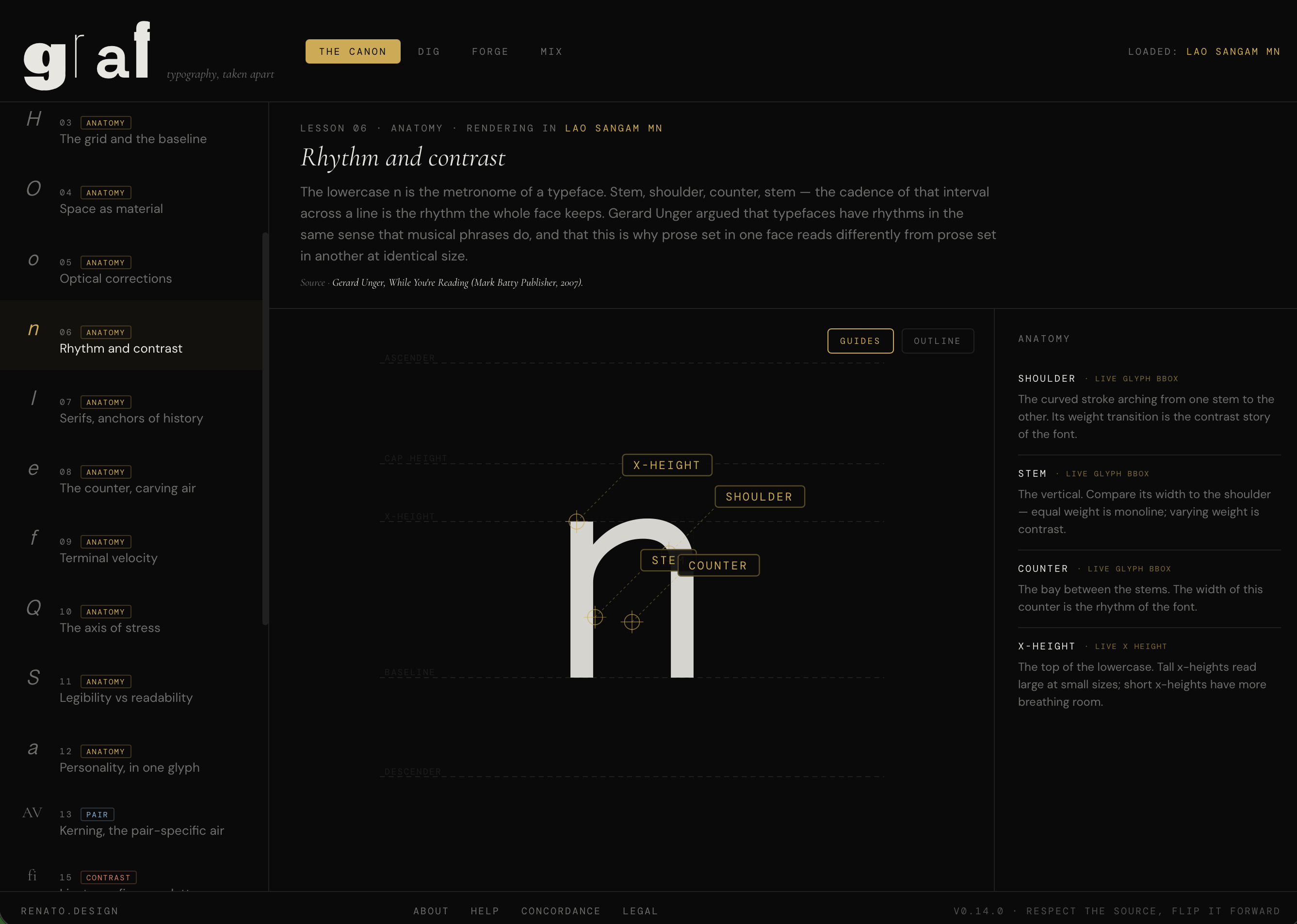
Twenty-three lessons in seven kinds — anatomy, pair, line, block, contrast, scale, variable. Twelve anatomy lessons teach against a fixed reference face so the labels stay pedagogically correct — a double-story a has different anatomy than a single-story a, a humanist O has a stress axis where a geometric O doesn’t, and one reference teaches it right. Eleven further lessons speak directly to your file: kerning, ligatures, leading, measure, figures, small caps, color-of-type, and more, through live interactive demonstrations. The optical-size lab renders the same letter at five point sizes and snaps the opsz axis (if the file ships one) to each, surfacing real optical compromises. The mechanical-skew lab compares a skewed roman with a true italic, so you can see which files redraw and which only lean. A final lesson reads the font’s variable axes and gives you a slider per axis.
Every lesson cites a source. The sources are books (Bringhurst, Hochuli, Noordzij, Beier, Ruder, Updike, Catich, Unger, Cheng, Tselentis), essays (Warde’s Crystal Goblet, Morison’s First Principles), and published work by living practitioners.
Font-Book-level inspection — hero specimen, waterfall, every OpenType feature as a toggle, every glyph in a virtualized table, per-glyph path detail with on-curve and off-curve points, advance-width box, metric lines.
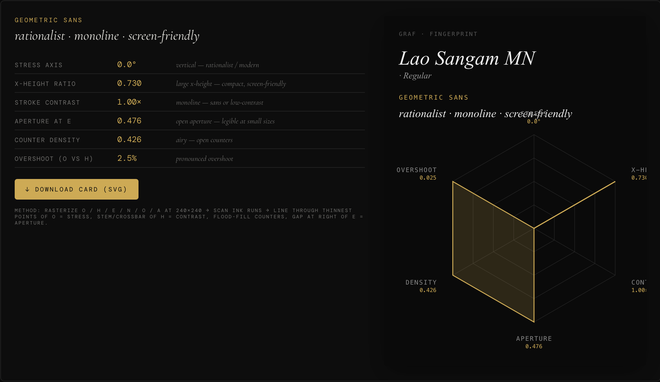
Fingerprint. Rasterizes O, H, e, n, o, a to a 240×240 offscreen canvas and derives six measurements from the pixel runs and the font’s own tables: stress-axis angle (from the thinnest points of the O bowl), x-height ratio (from the os/2 table, raster fallback), stroke contrast (H stem ÷ crossbar), aperture at the e terminal, counter density (flood-filled across lowercase), and overshoot (O vs. H, in font units). Downloads as a standalone SVG card with a six-axis radar chart.
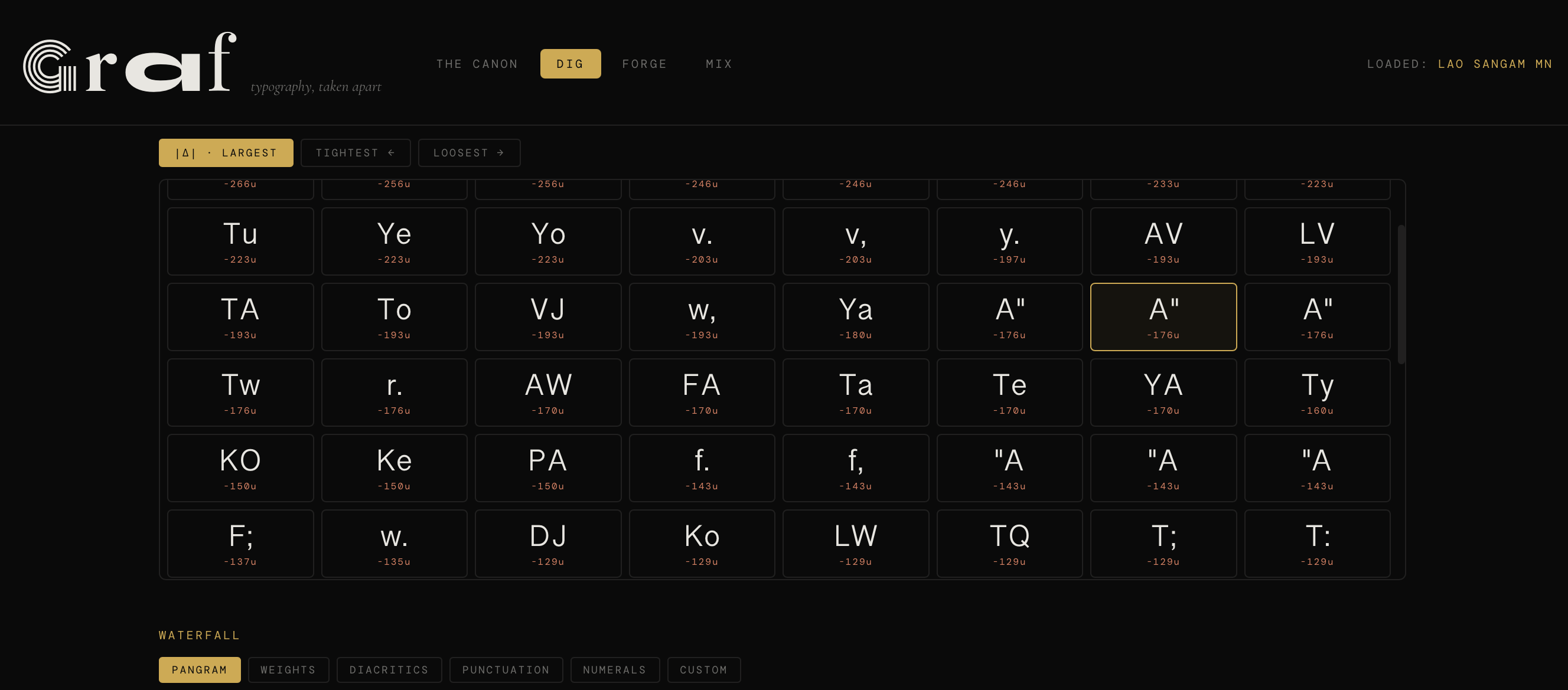
Pair Atlas. Enumerates every kerning pair the font ships — ≈6,400 candidate pairs queried through opentype.js’s getKerningValue. Filters to non-zero, sorts by magnitude, tightest, or loosest. Interactive preview with the font-shipped value plus ±300u adjustment. An empty atlas is also a verdict: some files simply don’t ship kerning.
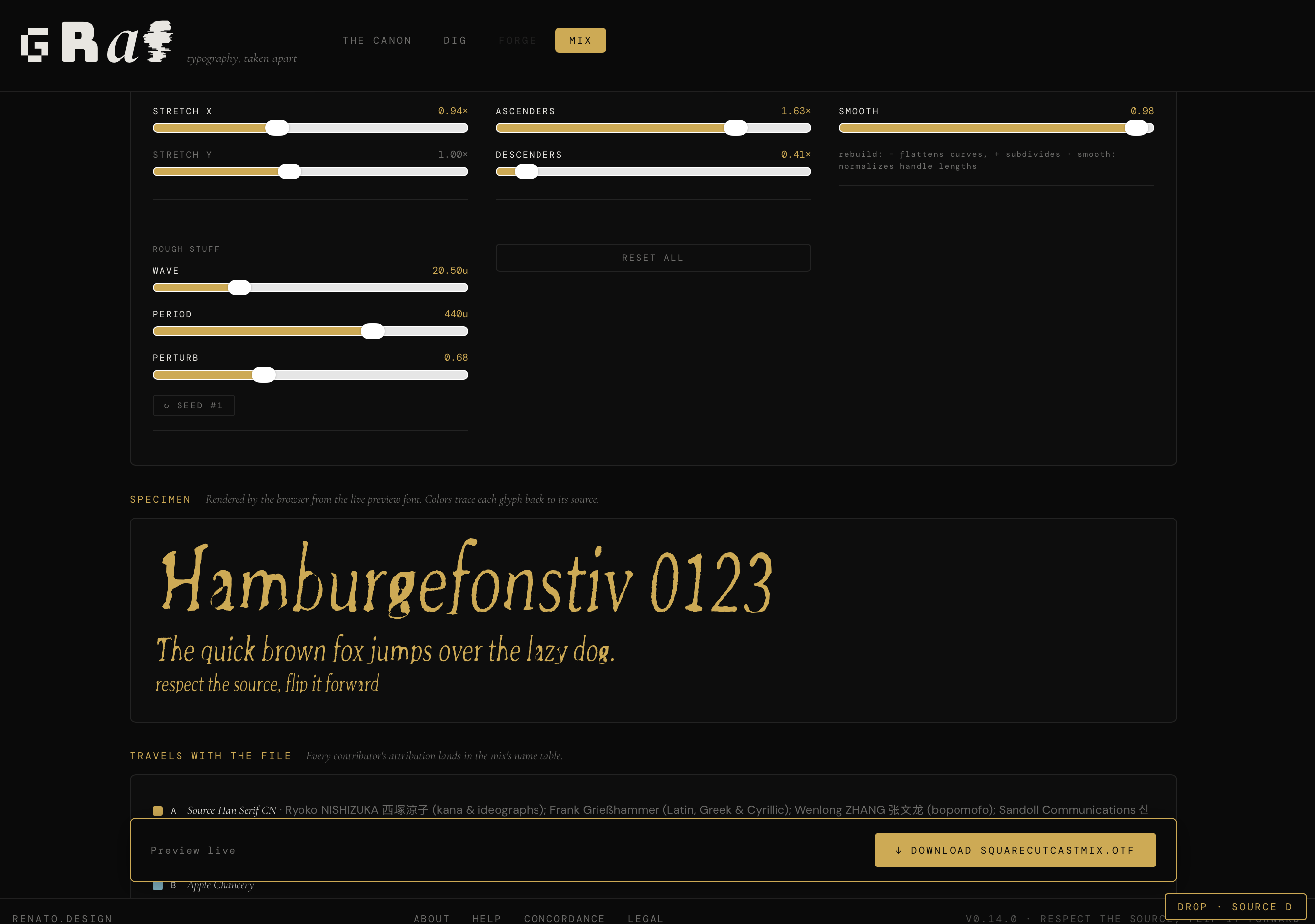
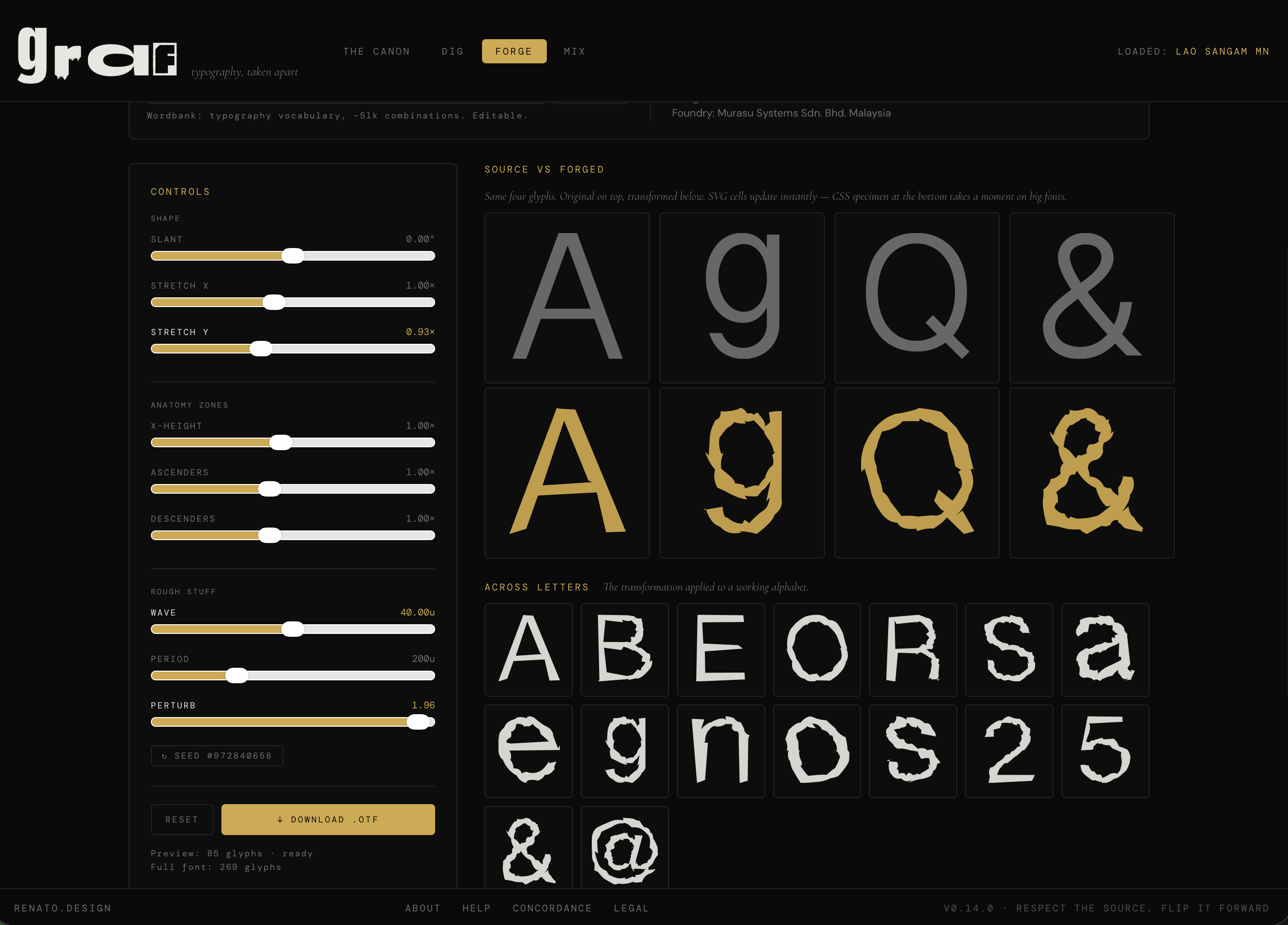
Programmatic remix. Walks every glyph’s path commands. Fourteen controls in five groups. Shape: slant, stretch X, stretch Y. Anatomy zones: x-height scale, ascender pull, descender pull — pivoting on the font’s real metric lines rather than the bounding box. Curves: rebuild (de Casteljau subdivision to add anchors, deterministic flattening to remove them) and smooth (cubic handles normalized toward 35% of chord length, taming lumpy outlines). Rough stuff: wave and seeded perturbation. Letter-level chaos: wobble Y, slant jitter, width jitter — each glyph pulls its own value from a seeded pool so the text varies letter-by-letter while every letter stays internally coherent.
Live preview compiles only the ≈100 characters on screen — stays fluid on 50,000-glyph files. Full-font compile runs only on download, with a visible progress banner. Source name records travel into the output verbatim.
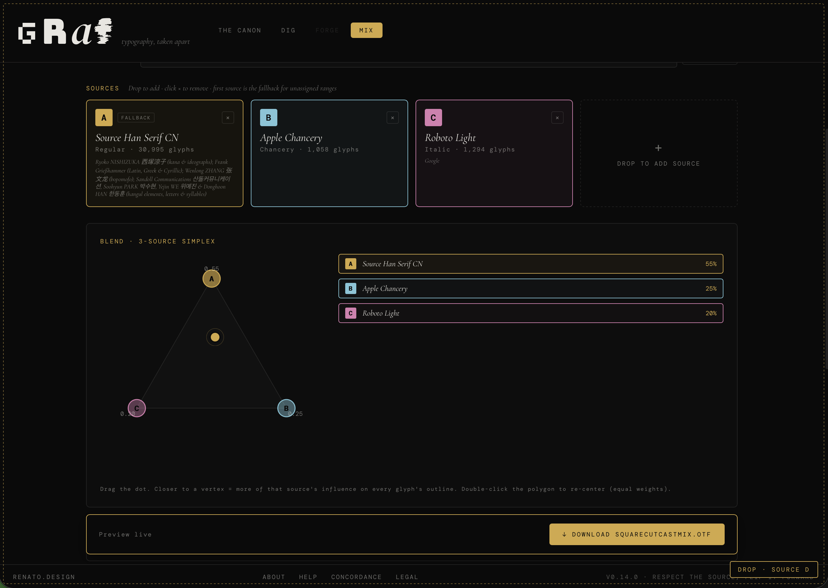
Drop two or more fonts, up to five. Blend interpolates outlines: for every shared codepoint each source glyph is sampled as a dense polyline per contour, contours are paired by signed area and size, arc-length-resampled to a common point count, rotationally aligned, linearly interpolated at the slider value, and refit as a cubic Bezier via chord-length-scaled Catmull-Rom. Real cubic commands out, not a CSS effect. Three-plus sources get a simplex polygon with barycentric (or inverse-distance) weights.
Pick composes range-by-range across fifteen canonical Unicode blocks. B from Bodoni, g from Garamond, digits from Space Grotesk. Forge transformations stack on top of either mode. Every contributor’s copyright, license, designer, and foundry land in the output’s name table.
Canon · Pair Atlas · Forge
graf reads .ttf, .otf, .woff, and .woff2. Internally it parses the OpenType tables directly: name (identity and attribution), os2 (vertical metrics, codepage and unicode ranges), fvar (variable axes), GSUB (feature substitutions such as liga, smcp, onum), GPOS (pair and kern positioning), the kern table (legacy), and every glyph’s path command set.
graf writes .otf — CFF-flavored OpenType — via opentype.js’s toArrayBuffer. Output should install on macOS, Windows, and Linux and opens in every text-setting application this author has tested. Round-tripping a font through Forge with identity transforms does not produce a byte-identical file: opentype.js re-serializes via CFF, so a TrueType (glyf) input comes out CFF. Not a bug, but a caveat.
Five centuries of people arguing about the same twenty-six letters. The app itself is a few thousand lines of TypeScript. The concepts inside it are older and harder than the code. The four-surface structure (Form → Text → Experimentation) owes a debt to Jason Tselentis’s three-part framing in Type, Form & Function (Rockport, 2011); we use his "Play Principle" as a named permission for what Forge and Mix do.
graf is an experimental research artifact produced through Iterative LLM Co-Authorship. It is not production software. It is not tested, certified, or supported for professional, commercial, safety-critical, or regulated work. It may produce output that looks plausible but is wrong. It may break. It may crash your browser tab. Your font file stays in your browser — nothing is uploaded or retained — and that’s the only promise made here.
By using graf you accept that you’re responsible for what you do with it, what you do with its output, and whether any of it fits your purpose. Phil isn’t liable for any damage — to a project, a file, a font license you might be obliged to, a system, a deadline, a reputation, or anything else — arising from your use of the app or any artifact it writes. If any of that is a problem for your use case, don’t use graf for that use case.
graf is monolingual — Latin alphabet, English reading context — because applying Latin anatomy to Thai, Arabic, Devanagari, Hangul, or CJK would be reductive and often wrong. It reads each font’s license well enough to refuse writes against sources that forbid further remixing; it does not otherwise certify type classifications, validate licenses, replace Glyphs or FontLab, or tell you whether shipping a derivative is clean. The Fingerprint’s labels are heuristics. It can be wrong, especially on display or icon fonts.
graf cites books, living practitioners, foundries, podcasts, and institutions throughout its Canon sources and Concordance. These are influences, not endorsements. Typeface and foundry names are trademarks of their respective owners; their mention here is nominative fair use. If a citation is inaccurate or you’d rather not appear in it, Phil will remove it on request — write to philrenatoatgmail.
The long version of all of this — what graf does, what it doesn’t, script scope, attribution posture, trademarks, copyrights, how your font file is handled — lives in the Legal panel inside the app. Reachable from the footer next to About, Help, and Concordance.
Open it on a laptop. The Canon sidebar, the Pair Atlas grid, and the Fingerprint’s radar all need horizontal room to feel right. It runs on a phone — you can still inspect a file, read its credits, scrub a slider — but it’s feature-deprived there, and iOS Safari doesn’t pass drag-and-drop events. Use the picker button. For the full thing, use a keyboard and a real display.
No install, nothing to download — your fonts never leave the browser, and nothing about them is stored anywhere. Reload the page and every loaded font is gone. Honestly, that’s kind of the point.
Built through Iterative LLM Co-Authorship — Phil Renato and Claude, trading drafts until Phil hit a sleep window and Claude hit a context window.