
tinkering with fragile schedules
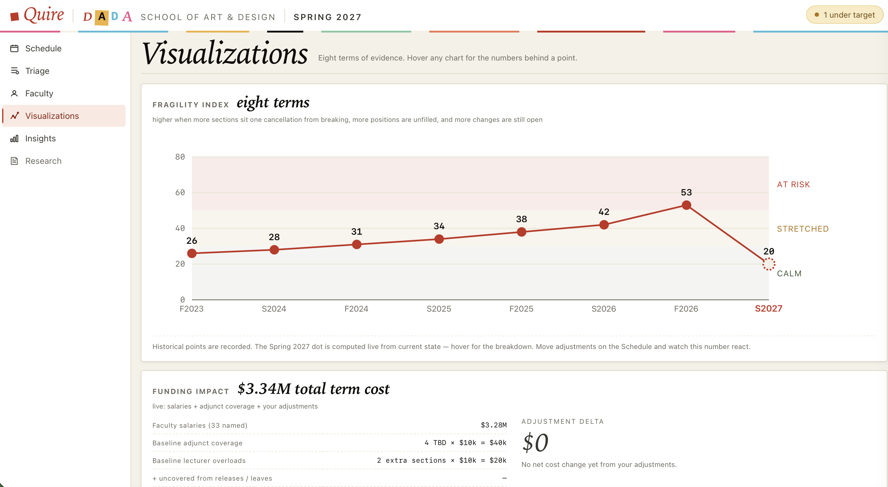
A direct-manipulation cascading change visualizer for an academic schedule. Click any class - adjust it. Click any faculty - release a section, full sabbatical, leave, retirement, target load, preferences. Adjustments stack.
The fixture is invented. Imagined faculty in a design school, eighty sections, twenty-one rooms, a Spring 2027 term with four sections still TBD on day one. None of it is real. The shape wants to be. Tenure-line miss their target loads if you don't watch them. Lecturers cost more when you ask them to overload…
A brief input - release someone, off one section, sabbatical, leave - returns three plans for the same disruption. One minimizes total perturbation. One protects day, time, course, and room preferences for tenure-line above all else. One spreads the burden across the lecturer pool with a single-section cap per person. Each plan reports its own metrics: total moves, induced preference strain, an equity index on extra load, hires posted, dollar delta. Apply commits. Preview tries it on the calendar grid first, with a banner offering keep or revert.
A small research shelf under the nav carries the literature any of those strategies leans on.
The same school has a woodshop, and the woodshop has a desk. WouldShop is that desk: swipe a student's card or type a name, see the eleven machines with the cleared ones lit, check them out on the rest against a rubric the instructor watches for. A class that finishes its milling unit gets certified in one pass, with a matrix for the student who missed jointer day. Three strikes and the card goes red.
Twenty invented students, six invented courses, the same imagined faculty. The roster lives in the browser and leaves as a file. A USB card reader in keyboard mode works as-is; the placards on the kiosk page are for the open computers by the tool crib.